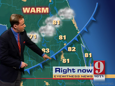
Cartographic Animation, as depicted above, is used to demonstrate movement across land that would otherwise be very difficult to communicate or explain. We see this animation most commonly from our weather person on the news showing the movement of Low pressure or High pressure air and how that should effect our climate.
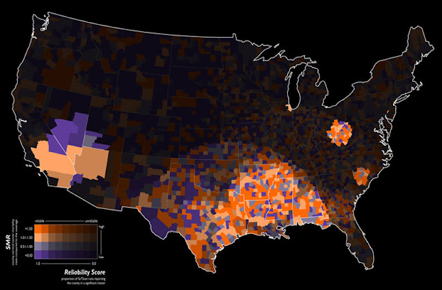
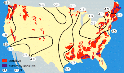
The data in this choropleth map is standardized to allow comparison of distribution among the different areas in the United States. In this map, the morality ratio is standardized in order to show reliable, high risk clusters of cervical cancer.
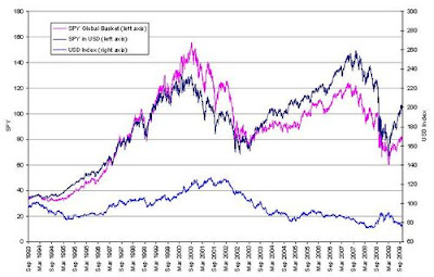
This index value plot shows the US Dollar or USD fluctuation over the last 20+ years. Notice it has ranged between 90 and 120. Currently this shows that our Dollar has "rallied" or made a positive increase in value recently.
These brightly colored Infrared Aerial Photographs show great detail about the Earth's land formations, resources and vegetation. These photos allow for the accurate mapping of ground cover and are usually taken from satellites like those in the Landsat program.
A Public Land Survey System is used in the United States to survey and identify land parcels, especially for making titles and deeds of the land. This particular image is from Google Earth showing the PLSS from an aerial photograph taken from a satellite.
A classedchoroplethmap is a type ofchoroplethmap that separates the data into small intervals. It is broken down into a scale and presented using colored intervals to visually demonstrate the variation among intervals. In this map there are 5 intervals that are identified using five different shades of pink. These intervals break down the amount of spending in millions by residents of Great Britain.
http://math.yorku.ca/SCS/Gallery/milestone/thumb5/popup/bssn1_popup1-19.htm Unclassed Choropleth maps use the technique of assigning shadings proportional to the data values in order to create choropleth maps without having to classify the data. They are not widely accepted because the cartographer looses the direct ability to communicate their message. For example, this map showing the distribution of illiteracy in France was created in 1826.
Bivariate choropleth maps display two different variables on one map by including two different sets of graphic symbols or colors. For example on this map the two variables shown are the excess fuel consumed and the urban area size. They are communicated through the use of the gas pump symbol and the three color scale.
http://www.answers.com/topic/spider-plot A star plot is a graphical data analysis method used to compare the relative behavior of all of the variables in a multivariate data set.This plot shows the numbers of farms of different types in different regions of England, all represented with a different dotted line.
http://www.hydroguam.net/map-topo-dem.php DEM maps or Digital Elevation Maps are topographic maps that display data on the elevation of land masses. In this map of Southern Guam we see the elevation of the land demonstrated through a rainbow color scale ranging from red representing 1000 ft to blue representing 0 ft.
DLG or Digital Line Graphic maps show boundaries, roads, and other various information found on topographical maps. This map is an example of a US Geological Survey of roads.
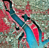
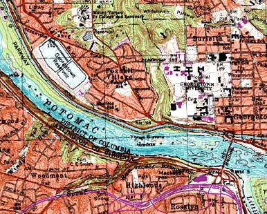
A digital raster graphic or DRG is a scanned image of a U.S. Geological Survey topographic map. The image inside the map is georeferenced to the surface of the Earth. For example, this map references Washington West, D.C.
http://www.scoop.co.nz/stories/AK0808/S00090.htm Isohyets are lines that are drawn through geographical points recording equal amounts of precipitation over a specific period. The contours on this map show the month’s rainfall in 100mm bands in New Zealand's Taranaki region.
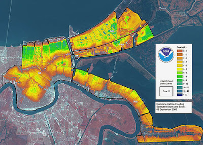
http://flickriver.com/photos/gisuser/tags/letham/ A LIDAR Map is a high-resolution digital elevation map that is enhanced with color to show the variation among elevations. This is a LIDAR map of New Orleans after hurricane Katrina to show the elevation of the flooding.
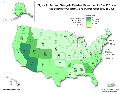
http://georgiainfo.galileo.usg.edu/gastat.htm This is a statistical map of the United States. This statistical map is from the U.S. Census Bureau showing the percent change in resident population from 1990 to 2000.
http://math.youngzones.org/stat_graph.html Histograms are a special type of bar graph used to summarize groups of data. This particular Histogram shows the age ranges of cigarette smokes in 1992 divided by sex into male and female graphs.
http://queue.acm.org/detail.cfm?id=1805128 This is an example of a correlation matrix. In a correlation matrix, the covariances are shown between elements of a random vector.
http://queue.acm.org/detail.cfm?id=1805128 This is a range graded proportional map.The proportion of the circle corresponds with the size of the state and the color corresponds with the percentage of obesity in each state.
http://queue.acm.org/detail.cfm?id=1805128 This is a proportional circle map of the United States. The pie charts show the normal, overweight, and obese percentages for the entire U.S and are sized according to the state's population.
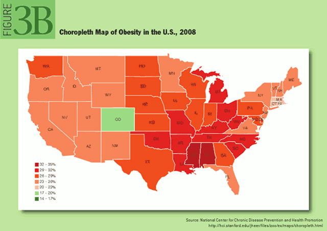
http://queue.acm.org/detail.cfm?id=1805128 A choropleth map is a type of thematic map where areas can be shaded or patterned in proportion to the measurement of the statistical variable being shown on the map. In this map, the variable is the obesity in the U.S. is 2008 and the variation is demonstrated through shading.
http://queue.acm.org/detail.cfm?id=1805128 A parallel coordinate graph is used to plot large multivariate datasets.This is a parallel coordinate gram of various automobile data.
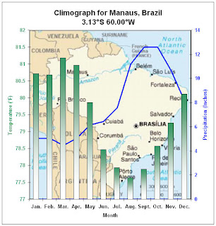
Here are two examples of a climograph. A climograph is a graphical depiction of the monthly precipitation and temperature conditions for a certain location, like for example the second map shows the climate for Brazial where as the top map shows the climate classifications for the entire world.
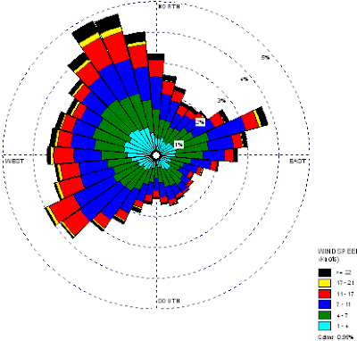
A windrose map looks exactly like it sounds, a rose that describes the wind speed at a particular location over a specific period of time. Meteorologists use this map to provide a visual depiction of wind direction and frequency at a given location.
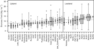
A box plot is a handy way to graphically and visually depict groups of numerical data through their five-number summaries. This is a box plot of a biomass yields for upland and lowland cultivars of switchgrass.
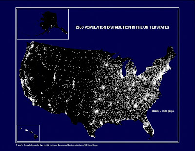
http://www.census.gov/geo/www/mapGallery/2kpopden.html This beautiful dot distribution map is also known as the "nighttime" map because of how it depicts the lights from cities that are bright enough to reach space. Each dot represents a population of 1,000 people. This map was taken by the U.S. Census bureau.
http://wn.com/Contiguous_United_States Hypsometric maps use color to represent the elevation of the terrain. This colorful map shows the elevation range for the entire United States. The color range chosen corresponds nicely with the different regions across the U.S.
http://www.emapstore.com/maps/tmfl3438.html This planimetric map of St. Petersburg shows only the horizontal distance between things. The blue labels of 100, and 200 show the distance horizontally between the different features such as Jannus Landings and the Hampton Inn.
A cadastral map is a map that shows the boundaries of ownership on land parcels. They are used as legal maps to record property ownership. This is a historic cadastral map of Logan, Australia and is quite large.
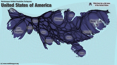
Acartogramis a map in which the area and size has been rescaled in proportion to the variable being studied. For example, this is a map of the United States that has beenresizedin order to reflect the population in proportion to the actual size of the state.
This picture is composed from 600 drinking cups with different colors and statistics to show the increased amount of obesity in the United States. This map is from a collection of different art forms of propaganda against how the nation has become so fast food oriented and its negative effect on the overall health of our country.
http://www.answers.com/topic/lorenz-curve A Lorenz curve is used to display probability distribution. The straight line shows the values if X and Y if they were proportional, and the curve shows the actual distribution. This particular Lorenz curve shows the relationship between the perentage of income and the percentage of population.
A population profile can be presented in the form of a population pyramid. This pyramid displays both sex and age percentages for 2007 in the United States.
Mother Nature spills more oil into the environment than Exxon, Shell and BP combined This stem and leaf plot shows the breakdown and range of the different ages at a family reunion. Stem and leaf plots help to organize a large amount of information into a very small and compact space. They are easy to understand and compare data ranges.
Above is a Pie Graph I found in an article about a Fox news story on offshore drilling for oil. In the article, it explains that the argument of the story is that Mother Nature spills more oil than Exxon, Shell, and BP put together. This pie graph represents the different sources and their percentage of contribution of oil into the water. This pie graph is also an example of critical cartography because of the choice of information selected to make this argument that mother nature makes more of a contribution of oil into the environment than consumers, transportation, and offshore drilling combined.
Above is a scatter plot of thirty of Alex Rodriguez's home runs during the 2010 season. A scatter plot uses Cartesian coordinates to display values for two variables from a given set of data. In this case, the variables are the distance and angle of the hit. Baseball is one of the many sports to use tools like this scatter plot to study and gain knowledge and hopefully an advantage against an opponent.
Above is a Doppler Radar image of Hurricane Katrina from 2005 that devastated the state of Louisianna and caused tremendous loss and destruction that is still being repaired today. The color scale makes it very clear and visible how intense the inner part of this hurricane reached; The red patches in the center show it reaching up to a category 10 Hurricane.
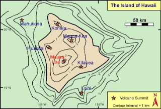
Above are two topographic maps of the Big Island of Hawaii. The first (top) map uses contour lines with an interval of 1 km to show the elevation and shape of the land, and labels all of the volcano summits on the island. The second (lower) map only labels the two volcano summits of Mauna Loa and Mauna Kea, and uses a slightly smaller scale to detail and show the elevation and shape of the land. Though the first map is easier to understand visually because of its use of labels and symbols, the second map provides a better visual representation of the actual shape and contour of the Island.


