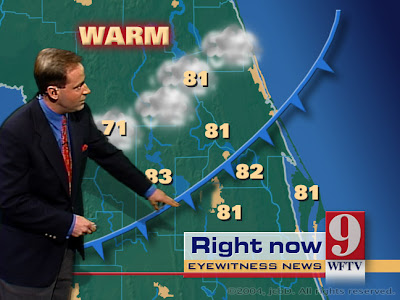
Cartographic Animation, as depicted above, is used to demonstrate movement across land that would otherwise be very difficult to communicate or explain. We see this animation most commonly from our weather person on the news showing the movement of Low pressure or High pressure air and how that should effect our climate.
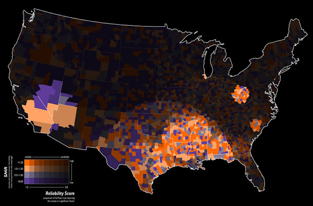
The data in this choropleth map is standardized to allow comparison of distribution among the different areas in the United States. In this map, the morality ratio is standardized in order to show reliable, high risk clusters of cervical cancer.
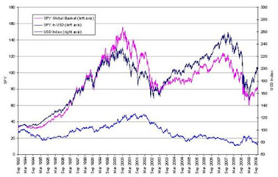
This index value plot shows the US Dollar or USD fluctuation over the last 20+ years. Notice it has ranged between 90 and 120. Currently this shows that our Dollar has "rallied" or made a positive increase in value recently.
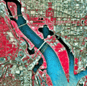
These brightly colored Infrared Aerial Photographs show great detail about the Earth's land formations, resources and vegetation. These photos allow for the accurate mapping of ground cover and are usually taken from satellites like those in the Landsat program.
A Public Land Survey System is used in the United States to survey and identify land parcels, especially for making titles and deeds of the land. This particular image is from Google Earth showing the PLSS from an aerial photograph taken from a satellite.
A classedchoroplethmap is a type ofchoroplethmap that separates the data into small intervals. It is broken down into a scale and presented using colored intervals to visually demonstrate the variation among intervals. In this map there are 5 intervals that are identified using five different shades of pink. These intervals break down the amount of spending in millions by residents of Great Britain.